Product Page Teardown: How $10M+ Shopify Stores Structure Pages to Convert
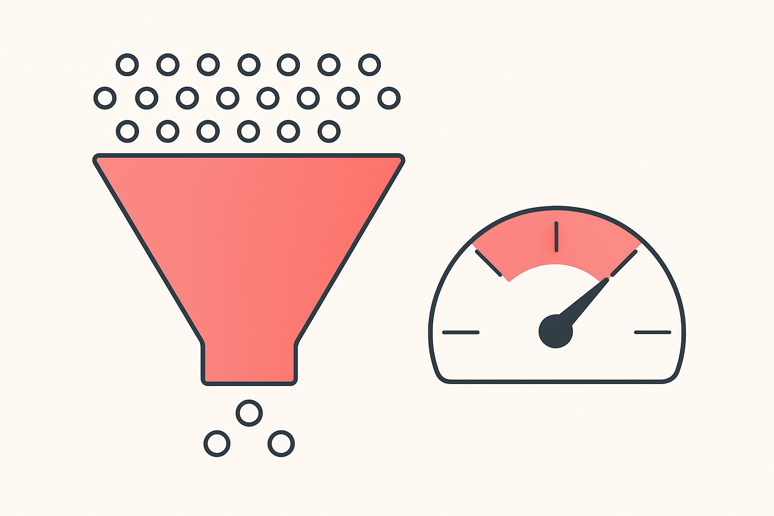
Most product pages do not lose sales because the product is wrong. They lose sales because the page is built in the wrong order, asks for the sale before earning it, or buries the one thing a buyer needs to click. The stores pulling seven and eight figures a year do not guess at this. They follow a repeatable layout, and the layout is copyable.
This is a teardown of how Shopify stores doing $10M+ a year structure their product pages, broken into the exact blocks you can rebuild on your own store this week. The pattern below comes from a founder who studied hundreds of stores that do €10M or more a year, cross-checked against a seller who used the same conversion-first thinking to go from struggling to $11,158 in 17 days.
The exact section order, top to bottom
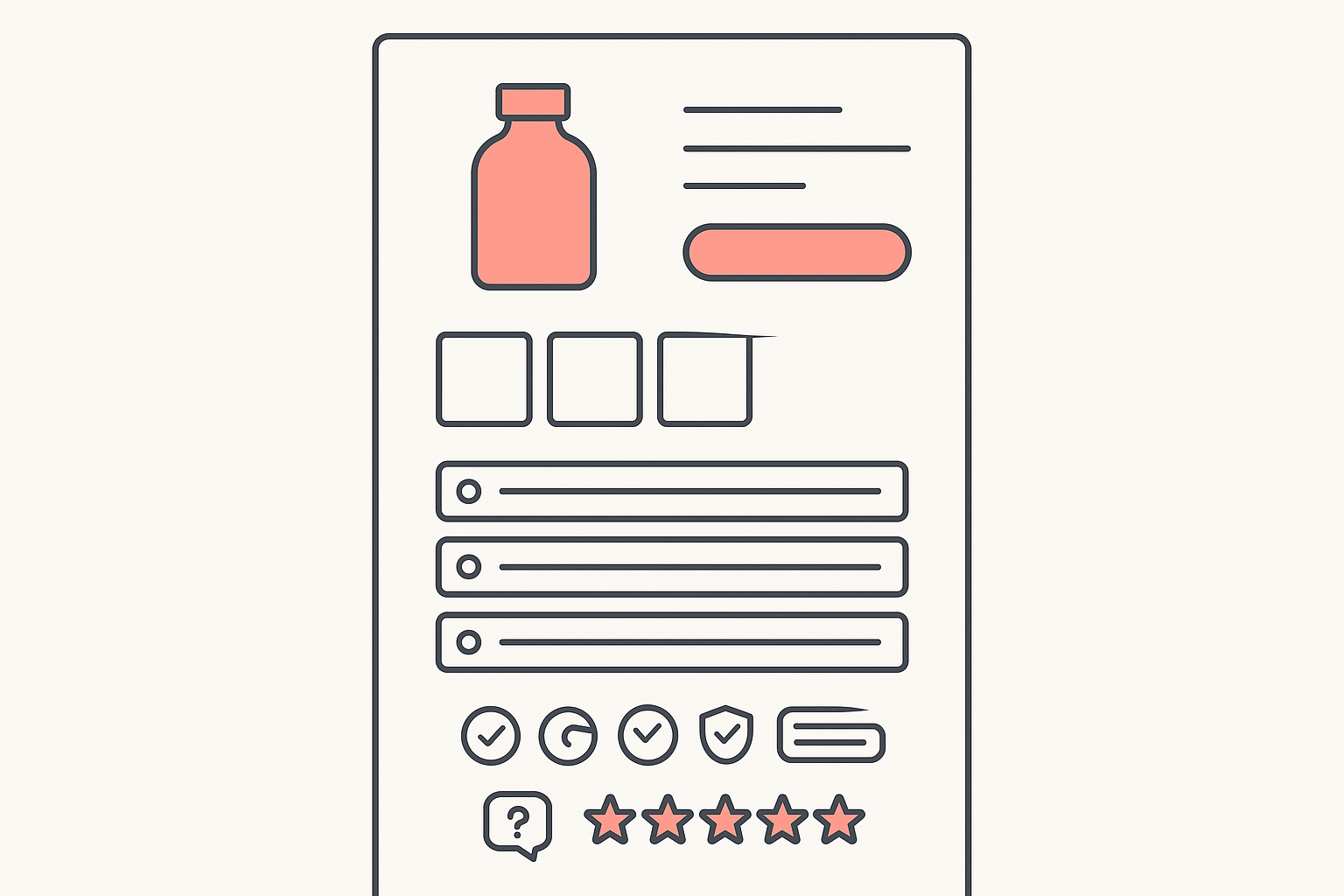
A high-converting Shopify product page stacks its blocks in this order: above-the-fold hero with product image, benefit-led headline, price and bundle offer, and one add-to-cart button; then the image sequence (white-background shot, angles and feature shots, real-life usage); then variant and bundle selection; then the trust stack (free shipping, returns, secure-payment icons, visible support); then reviews placed in more than one section; then a light scarcity element; then an FAQ with at least ten real questions. Build in that order and a buyer gets each answer in the order they ask it.
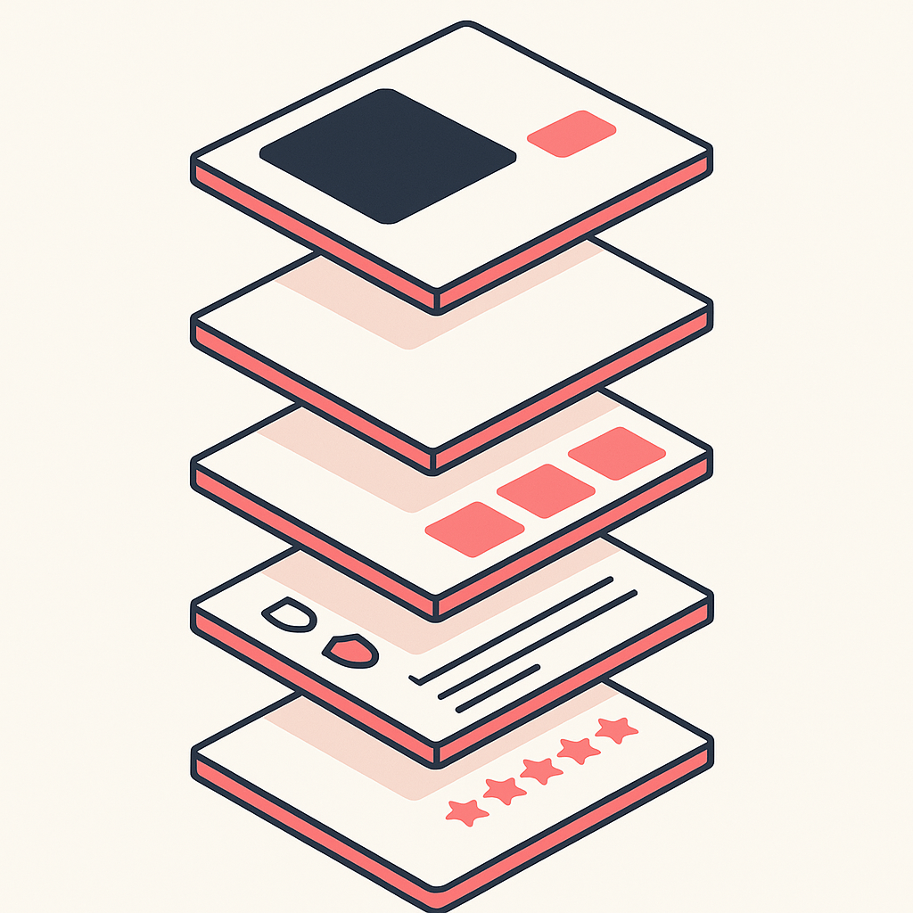
Table of contents
- Above the fold: hero, offer, one CTA
- The image sequence that does the selling
- Variant and price framing that lifts AOV
- The trust-signal stack
- Where to place social proof
- Scarcity without the fake countdown
- The FAQ block
- Optimize the store to convert, not just run ads
- Reverse-engineer any winning page with Koala Inspector
- The copyable section-by-section checklist
- FAQ
Above the fold: hero, offer, one CTA
The space a buyer sees before scrolling has to do four jobs at once. Show the product clearly, name the benefit, state the offer, and give one obvious button to press. Big stores keep this part disciplined: a clean product image, a headline that leads with the problem it solves rather than a spec sheet, the price with the bundle saving visible, and a single add-to-cart call to action. The seller who scaled to five figures in 17 days put it bluntly: fix your product page first with a clear headline, strong images, social proof, and one obvious CTA, because if the store cannot convert warm traffic, cold ad traffic just bleeds the budget.
Two design rules from the $10M teardown keep this section clean. Use only two main colors, applied consistently, with the main color reserved for buttons and the selected offer so the eye lands on the action. And keep the messaging tailored to one specific audience inside your niche, not the whole niche at once.
The image sequence that does the selling
The image order is doing more work than any paragraph of copy. The pattern high-revenue stores follow runs in three stages: first image is the product on a white or plain background, then multiple angles and detailed feature shots, and finally real-life usage photos, which matter most for tech and electronics. The sequence walks the buyer from "what is it" to "what does it do" to "what does it look like in my hands."
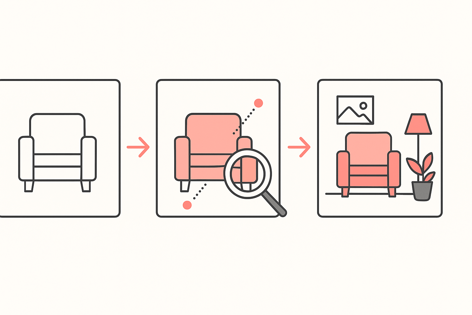
Skipping a stage costs you. A page that opens with a lifestyle photo and no clean product shot leaves buyers unsure what they are actually getting. A page with only studio shots and no usage photos leaves the benefit abstract. Order the gallery, do not just fill it.
Variant and price framing that lifts AOV
This is where average order value is won or lost. The default the big stores reach for is three quantity offers: one unit at a small discount, two units at a larger one, three units at the largest. Use two tiers only when the product does not justify more, and four only in rare high-volume cases. Naming stays plain, for example "1 Bottle, 2 Bottles, 3 Bottles", or "1 Month, 2 Months, 3 Months" for consumables.
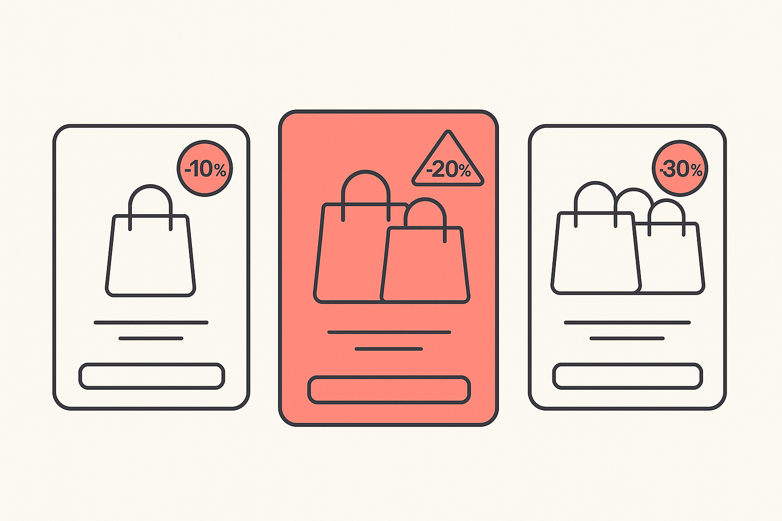
How you show the saving depends on price. For low-ticket items in the 20 to 60 range, show the percentage discount. For higher-ticket items around 100 to 200, show the saving as a dollar (or currency) amount, because a number a buyer can picture lands harder than a percentage. The seller who hit $11,158 added a "limited offer" bundle and moved prices to end in .99, and watched AOV rise and ad spend get more efficient as a result. If you want to go deeper on the mechanics, our guide on how to upsell on Shopify breaks down the offer types that pair well with this layout.
The trust-signal stack
Trust is not one badge, it is a stack, and the high-revenue pattern places it deliberately. Free delivery shown clearly at the top. Free returns within a set window, often 14 days. Secure-payment icons. And visible customer support: an email address (treated as mandatory), a phone number (strongly recommended), and support hours. The point of stacking these near the offer is that every one of them removes a reason to hesitate right at the moment of decision.
Where to place social proof
Reviews are not a single block you drop at the bottom. The stores that convert show customer reviews in more than one section of the product page, so social proof is in view at the offer, again near the description, and again lower down. A buyer who scrolls past one cluster of reviews meets another before they leave. Real reviews with photos beat a star rating with no substance behind it.
Scarcity without the fake countdown
Urgency works, fake urgency backfires. The $10M teardown is explicit on this: build trust without pressure tactics and avoid fake urgency. A countdown timer that resets every time the page loads, or "only 3 left" on an unlimited-stock dropshipping product, reads as dishonest to experienced buyers and can cost more trust than the nudge is worth. If you use scarcity, tie it to something real, such as a genuine launch window, a true low-stock variant, or an offer with an actual end date.
The FAQ block
A strong FAQ is a conversion tool, not a support afterthought. The big-store standard is at least ten real customer questions with detailed answers, kept updated. Answer the objections a buyer would otherwise leave to go search: shipping time, returns, sizing or compatibility, how it compares to the obvious alternative, and what happens if it does not work out. Each question you answer on the page is one fewer reason to open a new tab.
Optimize the store to convert, not just run ads
The most expensive mistake in dropshipping is pouring ad budget into a page that was never built to convert. The seller who went from struggling to $11,158 in 17 days, across 251 orders at a 3.89% conversion rate, named the order of operations directly: the store has to convert before you run ads. Most people throw money at Meta ads with a store that is not ready, and cold traffic against an unready page just burns cash.
Notice that almost none of that turnaround was an ad hack. It was the page: clear headline, strong images, reviews in view, one CTA, a bundle offer, and pricing psychology. Ads send traffic. The product page decides whether that traffic turns into orders. Spend your first effort on the structure above, then let the campaigns scale something that already works. The same lesson runs through our breakdown of how top-performing stores actually operate.
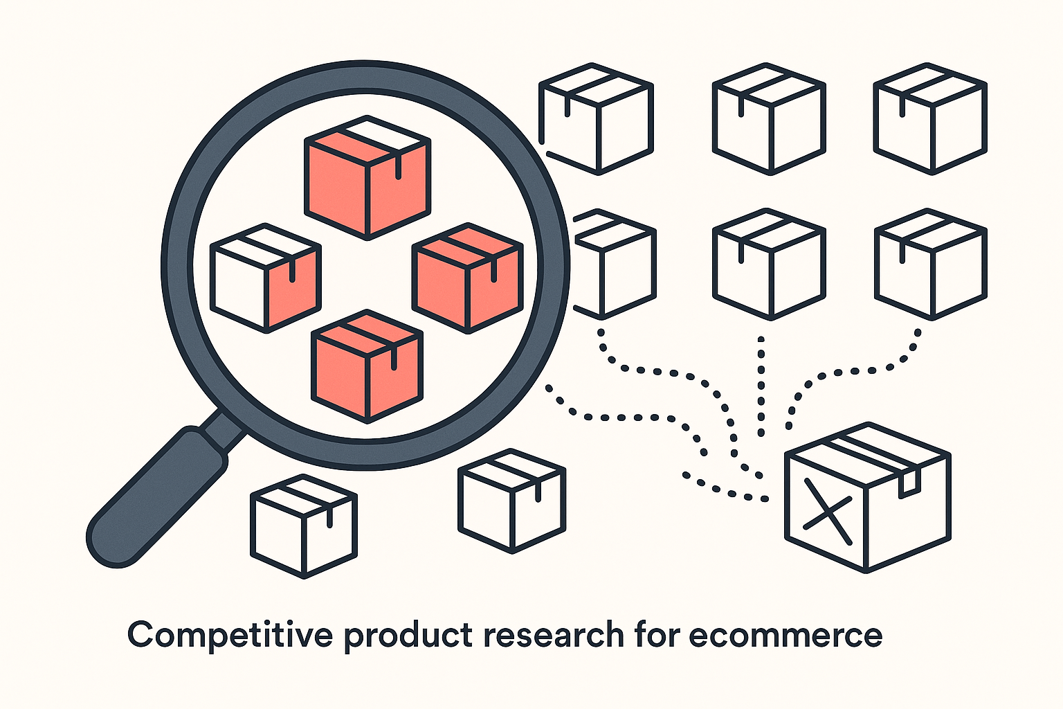
Reverse-engineer any winning page with Koala Inspector
You do not have to guess which apps power a competitor's reviews, upsells, or bundle offers. Open any winning Shopify store's product page with the free Koala Inspector Chrome extension and it detects the store's theme and lists every Shopify app installed, grouped by type. That tells you which review widget is showing all that social proof, which app is running the three-tier bundle, and which tool is handling urgency, so you can match the structure with apps you can install yourself.
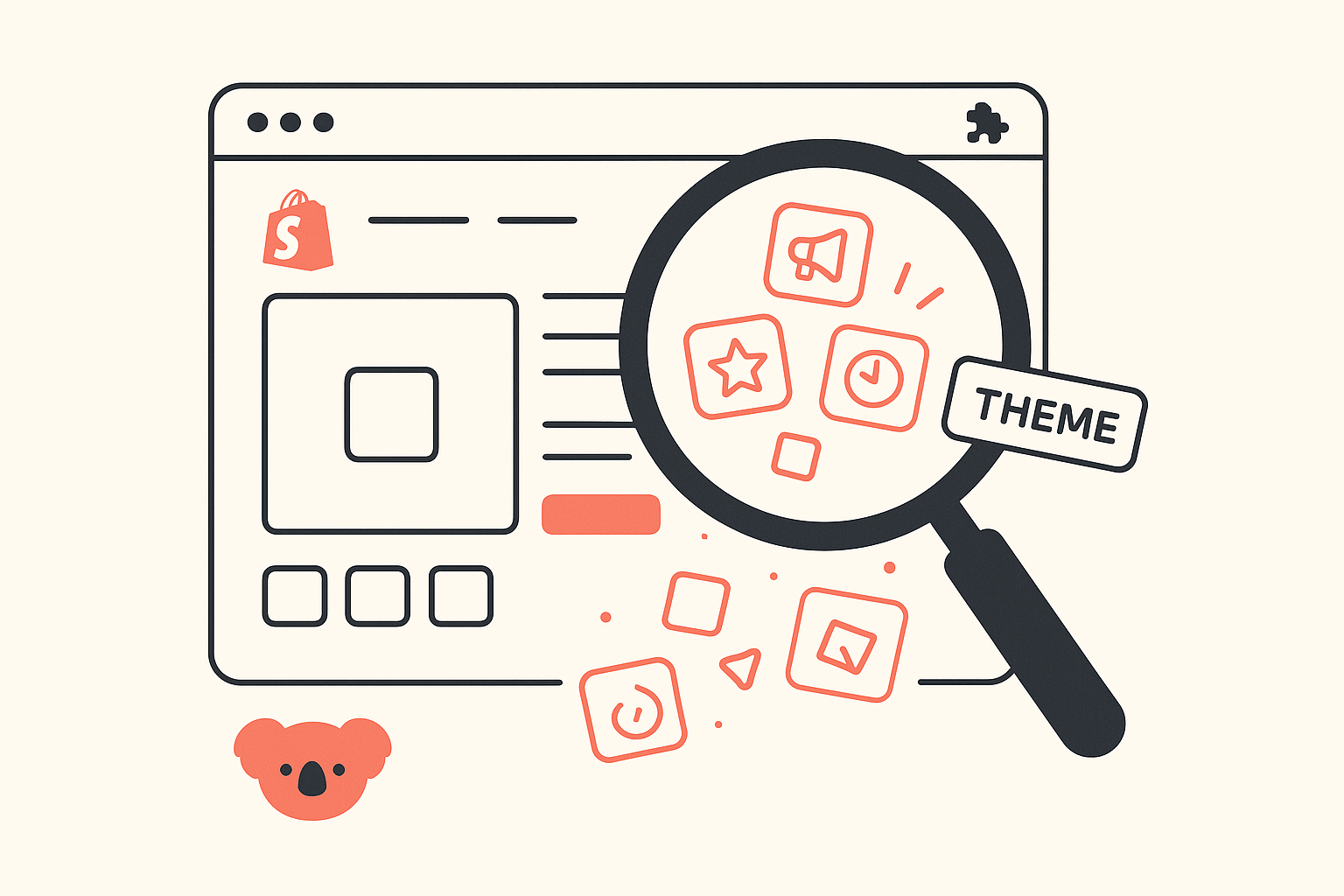
From there you can browse the store's catalog and likely best-sellers to see which products earn this treatment, and add the store to tracking to watch when it changes its offer or swaps an app. For a research workflow built around exactly this kind of teardown, see Koala Inspector for dropshipping, and the wider dropshipping playbooks on the blog. Reverse-engineering the structure of a proven page is far faster than inventing one from scratch.
The copyable section-by-section checklist
Run your product page against this, block by block:
- Above the fold: clean product image, benefit-led headline, price with bundle saving visible, one add-to-cart button, two-color palette with the main color on the button.
- Image sequence: white-background shot first, then angles and feature close-ups, then real-life usage photos. At least five to eight images, in that order.
- Variant and price: three quantity tiers with rising discounts, plain names, percentage saving on low-ticket items and dollar saving on higher-ticket ones.
- Trust stack: free shipping at the top, returns window, secure-payment icons, visible email, phone and support hours.
- Social proof: real reviews placed in more than one section, photos where possible.
- Scarcity: only if it is genuine, no resetting timers or fake stock counts.
- Description: lead with benefits and solved problems, split into clear sections, answer objections upfront.
- FAQ: at least ten real buyer questions, detailed answers, kept current.
Rebuild in that order and you are not copying a single store, you are copying the pattern the biggest stores converged on. Before you spend the next dollar on ads, make the page worth sending traffic to.
FAQ
What is the best section order for a high-converting Shopify product page? Top to bottom: above-the-fold hero with product image, benefit-led headline, price and bundle offer, and one add-to-cart button; then the image sequence (white-background shot, angles and feature shots, real-life usage); then variant and bundle selection; then the trust stack (free shipping, returns, secure-payment icons, visible support); then reviews in more than one spot; then a light, genuine scarcity element; then an FAQ that answers at least ten real questions.
How many product images should a Shopify product page have? Aim for at least five to eight, in a deliberate order. Lead with the product on a plain white background, follow with angles and detailed feature shots, and finish with real-life usage photos. The order matters more than the count, because it walks a buyer from what the product is, to what it does, to what it looks like in their hands.
Do bundle offers really increase average order value? Yes, when the tiers stay simple. High-revenue stores commonly show three quantity offers (one unit at a small discount, two at a larger one, three at the largest) with plain names. Showing a percentage discount on low-ticket items and a dollar saving on higher-ticket items nudges shoppers to the middle or top tier and lifts average order value.
How do I see which apps a competitor's product page uses? Open the competitor's Shopify product page with the free Koala Inspector Chrome extension. It detects the theme and lists every installed Shopify app grouped by type, so you can spot the review widget, bundle or upsell app, and urgency tool behind the page, then reproduce the structure with your own apps.
Written by
Ana Gelevska
eCommerce Content Writer
Ana Gelevska is a content writer with more than five years of experience creating content for eCommerce brands and global clients. She digs into each topic and the people it is for, then turns it into clear, useful articles that Shopify sellers and dropshippers can act on.
Connect on LinkedIn